Hey, What Are You Looking At?

I always enjoy finding new ways to create simple cards.  I like simple cards, that can be produced quickly.  When I need a very special card, I don’t mind taking a long time to make it.  (For me, long time is 1-2 hours).  Aside from those very special occasions, I like cards that I can easily make 3-5 of in less than an hour. 

I took this inspiration from Heather at housesbuiltofcards.blogspot.com.  I have to say, though, she totally rocked the idea better than I did!  I wasn’t really digging mine.  I think it’s mostly because the scallop die I used is too big.  This is the Lawn Fawn die, she used the Mama Elephant die.  I think I’m going to just have to buy that die.  Sigh.  (twist my arm, right?)

IMG_7107

Well, I began stamping these with the MISTI when I realized (five later) that I had made a big mistake.  So, I set out restamping the images on new cardstock.  I was just going to toss the images.  After completing this card, and not really digging it, I was ready to throw in the towel.  Then, I realized that I can make a teaching point out of my mistake, because it was a very good example, and one that I don’t tend to make.

I snatched up those mistaken stamped pieces and a couple markers to make the point.

Here goes.

What are you looking at?

Really.  It’s important.  Are you encouraged to look at the card, or off the card? 

What do I mean? 

Well, let’s look at the image again. 

IMG_7107

I was intentionally trying to get you to look at something.  Do you see an imaginary triangle on the card? 

Do you see how the ink blending makes a quasi-triangle?  And do you see the shape of the girl and the sentiment, how the outside points of each make a triangle?

That was intentional.  In design, we use something called a “visual triangle”.  Now, it’s not something that is really there, it’s just implied.  Sometimes it’s implied more directly than other times.  The visual triangle encourages the viewer to move their eye along the elements of the design and brings the focus to what you want to bring it to.  This is often achieved with embellishments such as sequin or rhinestones.  On this card, which is super simple, it is just the stamped images creating the triangle. 

Now, let’s take a look at my mistake and let me explain how the triangle can be utilized.

IMG_7109

See the puppy on top of the girl?  Where is the puppy looking?  Off the page.  The puppy is suggesting to us where we should look. 

But where do we want the viewer to look?  Not of the page, right?  We want them to look at the sentiment.

IMG_7111

Like this!  (Except this sentiment is also competing and messing us up). 

IMG_7112

This composition is confusing.  The puppy suggests us to look in a direction that we don’t want to look, as well as the sentiment being not lined up right. 

So, let’s see what we can do to improve this.

Knowing I wanted the puppy to look in and at the sentiment, I moved my stamps around.  I also lined the “hey” up on the closer side of the you.  This allowed the puppy to lead our eye right where I wanted it. 

IMG_7114

Look!  It follows the lines of the triangle.

IMG_7115

This composition is good.  It makes me happy and not confused.  Let’s be honest, I don’t need any extra help being confused.  o.O

IMG_7116

Thanks for joining me today and letting me share this.  (It’s one of my design “nails on a chalkboard” hangups – I know – I need to chill…lol)

Have a blessed day.

Supplies:
Neat and Tangled – stamp
Versafine Onyx Black ink
Hammermill Digital Color Copy
Lawn Fawn Guava paper
Distress Ink Abandoned Coral
Misc – hemp twine

Miss You Card

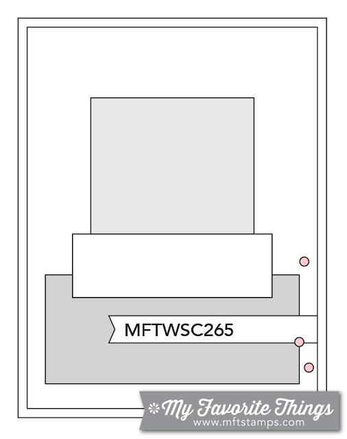
One of my favorite coloring mediums to use is watercolor.  While I keep my watercolor use pretty controlled, I really like that it is also forgiving.  Not quite perfection pairs perfectly with watercolor, which is great for me, considering I’m not an artist.  I was wanting to play with some watercolor and then do a very mild bleeding with it.  I thought the My Favorite Things Card Challenge Sketch 265 would be a good fit.

I modified the sketch a bit, I didn’t add the extra rectangles at the bottom and instead put a thread nest under my sentiment on vellum.  I really like how the card finished – a tiny bit of free form color bleeding but still very controlled.

IMG_6173

Supplies:
My Favorite Things – watercolor sentiments (miss you and hearts)
Bazzill – raspberry cardstock
Misc – gold thread & gold sequin, vellum, foam tape
Distress ink – picked raspberry, spun sugar, (and a red that I can’t remember!)
Ranger Perfect Pearls – gold

Better Late Than Never

I really couldn’t get my act together last week, or was it it week before?  We had VBS at church, and it just took every bit of mental energy I had!  It was a great week, but it left me drained.  I completed cards for a couple challenges, but I didn’t share them.  I really liked one (surprisingly!) especially so I’m going to share them anyway.

For My Favorite Things sketch – a striped background…you had me at hello.

IMG_4714

The next was for one of the Simon Says challenges.  I can’t remember what exactly it was, misting or masking….something I don’t enjoy doing.  So I went a little creative on it.  I used the falling heart mask and the abandoned coral distress ink to ink the background of watercolor paper.  I then took some pearl mist I made with perfect pearls.  I misted lightly that onto the ink to get it to move and run a little bit.  I really liked the way it worked on watercolor paper as opposed to regular cardstock.  However, it washed out the heart shapes more than I wanted, so I replaced the mask and used fired brick to recolor some of the heart.  It turned out fabulously!  I was quite surprised that I liked it.  I tried to mount it on cardstock completely colored with abandoned coral, but it was too much.  So I made an ombre’ background and it was the perfect touch.

IMG_4713

Memory Box Challenge

Someone recently told me about a new challenge that has begun.  I figured I’d play along, I mean, why not?!


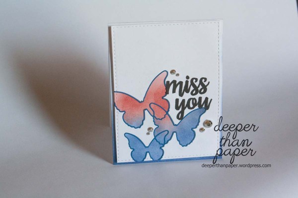
I saw the Memory Box Challenge #2 was red, white and blue and I knew I had to.  Especially in July.

I used my Memory Box butterfly die that I had just purchased and was anxious to play with.  Truthfully, I have to confess that I don’t have much blue in my stash, so I knew inks were the best approach.  Out come the distress inks!

IMG_4709

New Favorite – Fossilized Amber

I’m not one who participates in challenges to stretch myself.  I’m very happy with my style and my cards.  So, when I participate in a challenge and find something new, or am stretched and I like it, I’m usually taken aback.

This Simon Says Stamp challenge did that to me.  Not really the challenge so much, but because of the challenge, I found a new favorite color!

If you know me, you know that Fall and Winter are by far my favorite seasons.  I tend to think of inappropriate words when thinking of summer.  But, being as how I’m trying really hard to keep my thoughts and words positive and glorifying to God, I’m not going to dwell on my dislike of summer.  However, because of my natural inclination to avoid summer, I have very little in my stash that is summer themed.  Most people tend to hibernate during winter, I hibernate during summer.  So, to do a summer challenge, well, that’s a challenge!  But what do I think of when I think of summer.  The bright, yellow, HOT sun.

I made a mask with a SSS die and inked with distress ink Fossilized Amber.  I found I really like the color!  And, I really liked the card in general, so I decided to make more in different colors.

IMG_4707

IMG_4708

As I was making the card with abandoned color I realized that the card looked very much like the sketch for the My Favorite Things Card Challenge.  And, because I happened to use the new Written in Watercolor (adore!) stamps, I’m entering this card for that as well.

happy birthday♥ – SSS Wednesday Challenge

I send out a lot of birthday cards.  I only send out more thinking of you (random purpose) cards.  I needed a couple more cards this week.  Since I was going to sit down and make some cards, I checked the challenge sites first.

Simon Says Stamp Wednesday Challenge is a color palette challenge.  Be still my heart.  Seriously.  This color and pattern combination is my favoritest favorite currently.

And this stamp.  How had I not noticed until today that happy birthday ended with a ♥.  Really?  Too cute.

IMG_4232 IMG_4231Supplies:  Canson (watercolor paper), Distress Ink (tumbled glass), SSS (white embossing powder, stamp), Avery Elle (dies), Crate Paper (paper), misc (cardstock & foam adhesive)

Masculine Card

We always tease our son because he is a wealth of useless knowledge.  But I can’t fault him much, the apple doesn’t fall far from the tree.  I’m the same way, and I think I learned the trait from my Dad.  Today, I’m going to share some useless knowledge with you.  Just because I want to.

  • Americans purchase approximately 6.5 billion greeting cards each year. Annual retail sales of greeting cards are estimated between $7 and $8 billion.
  • It is estimated that 80% of these cards purchases are made by women.
  • Every year, Most people now acknowledge many more birthdays than ever before because of Facebook, but they aren’t necessarily sending fewer cards as a result. (I find this one interesting, as many other industries have taken a hit due to digital accessibility (print magazines, print newspapers)).

Did you catch the 80% bought by women part?  Yeah, it honestly doesn’t surprise me in the least, as women tend to be more wordy and such.  I’ve always had a hard time finding masculine cards I liked.  And I can’t help but wonder if it’s because of women are majority of the customer base.  I don’t subscribe to the idea that there are no differences between men and women.  Nope, nope.  So following the reasoning, it would make sense that it’s easier to find a feminine card than masculine (I think many masculine cards are still a bit feminine).

Along those lines, I always struggle making masculine cards.  Which is something I find a little ironic, because I really like simple cards.  Often masculine is (can be) simple as well.  But for some reason, I’m not good at mixing the two.

Well, this week we needed a card for a guy who we work with in a professional relationship.  He is by far the best person we have to deal with at his job, so we wanted to express our appreciation.

I have several Father’s Day stamps, but I don’t have any masculine, non-holiday sets.  But I pulled out an anchor from this Stampin Up Guy Greetings set and decided to watercolor it.  I find watercoloring to be the most relaxing way of coloring an image.  It’s all a matter of personal preference though.

IMG_4065

Supplies:  Bazzill cardstock, Stampin Up (Guy Greetings stamp), Tim Holtz distress inks, Canson watercolor paper, Papertrey Ink (sentiment stamp), Simon Says Stamp stitched rectangle dies

SSS Monday Challenge – Don’t Abandon the Coral

Yesterday I was given a new stamp by Unity Stamps.  It was this giant heart cluster.  Well, giant is relative, but compared to most of the stamps I have, I consider it giant.

So last night when I had some free time to make a couple cards, I pulled up the Simon Says Stamp Monday Challenge to use the new distress ink color Abandoned Coral.  I knew immediately that I wanted to use the ink with the heart collage stamp and use it to watercolor the insides of the collage.  Distress ink sure has some great properties for techniques!

I pulled out my old Wink of Stella brush.  That little gizmo is my favorite!  (gizmo doesn’t sound proper when speaking of an item with a feminine name?)  I have several of them because when one is used up, I don’t discard it.  I purchase a new brush to use for items which will not bleed onto the tip, and I refill with water the old one.  There is enough shimmer left clinging to the inside of the chamber for at least one refill, but likely more.  Additionally, it’s my favorite water brush of all that I’ve tried (I’m too cheap to buy the expensive ones), so even if there is no shimmer, I find it’s a great water brush.  I then use the refilled brushes for anything that could potentially contaminate the brush or chamber.  (I’ve had issues of my water brushes sucking up the wetted ink and contaminating the chamber, however, Wink of Stella doesn’t seem to do this!  Which is why I say it’s the best water brush of those I’ve used).

IMG_4080 IMG_4081

With the help of MISTI, I was able to whip out 5 of these cards in a little more than a half hour.  I didn’t have the correct color of cardstock (my selection is really rather limited), so I used the ink to color the card base.  Viola! It worked perfectly.

Supplies:  Neenah Index paper, Canson watercolor paper, Tim Holtz Distress Ink (Abandoned Coral), Unity Stamp, Simon Says Stamp (sentiment), Memento Brilliance Starlite Silver, misc (bling), Wink of Stella brush

Hello Friend

Lawn Fawn has the most adorable designs.  In the past, I’ve not used much lawn fawn because I have a hard time mixing cutesty with clean and simple.  And, most of their stamped images are designed to be colored.  I stink at coloring.  LOL.  But I found this little set on clearance sale, and this fox, so stinking cute, I couldn’t resist.

So I stamped this darling on watercolor paper and used my distress inks to watercolor it.  I prefer watercolor because it seems to be the most forgiving.  I do not have a still hand, and while I’m trying to train myself to do coloring, it’s not coming naturally to me.

All in all, I adore this card.  I know who I made it for, but, I’m having a hard time parting with it.  Maybe I’ll send her a picture of the card and keep the card myself.  No, I won’t do that.  But I’m tempted!

IMG_4170.JPG