I learned a long time ago to never say never. I learned this the hard way, through various things, when I had to eat crow and do the things I said I’d never do. (Like drive a 1980 Volvo – don’t ask, really.) I’ve also learned there are many things in life that we just can’t control. In addition to that, as we change, age and grow, our tastes changes. What is important is different. What we like can be different.
Today, I’m sharing a card in which I did three things that I’m a bit surprised I like. I can’t say I said I’d never, but I know for certain I’ve said I wasn’t likely to….
This card was made for the Papertrey Ink Make It Monday #220 challenge. This is another one of those things I didn’t expect, although I can’t say I’m surprised. I’ve loved their dies and stamps for years, although I’d had a very limited collection. But as I’ve been making so many cards lately, I decided to invest in their inks as well. Like ’em, yup, they’re my favorite, I’m pretty certain. I haven’t made a 100% complete decision, but it’s definitely leaning that way. (I’ll probably share more about that at a later time).
Enough rambling, on to the card in which I share the nevers (or almost nevers). The challenge was to use a piece of vellum to tone down a bold background. While my background was especially bold, I thought softening it would be fun anyway. So, the nevers:
1) Stamping my own background – I always thought this was way too time consuming. Yes, it did take a few minutes, but it was worth it. I’ve also found having several small blocks helps make it quicker, as I don’t have to mount, clean and unmount repeatedly.
2) Use Vellum! After all, vellum is so 1990s and old school! Until probably 8 months ago, I didn’t even any vellum in my stash. And use it? No, not so much. But, I’ve come to like it. I really like the Papertrey Ink vellum, it’s a great weight, and affordable.
3) Coral & mint. Yeah, that’s a color combo I thought I’d never get on board with. It goes back to the early 90s. My sister was getting married and peach and turquoise were her colors. They had to be exact! By the time the wedding was over, I was sick to death of peach and turquoise. The wedding was beautiful, but I wouldn’t have minded if I never saw the color again. So much so that when I chose my wedding colors about seven years later, I intentionally choose colors that I liked but I would be totally fine with if I was sick of them after the wedding. While I know coral and mint isn’t quite the same, it’s close enough that I thought I’d never, ever purposefully use those colors together. Okay, so this is one that I may have actually said never on.
Now that I’ve rambled on, let’s look at the card, which I happen to be thrilled with!
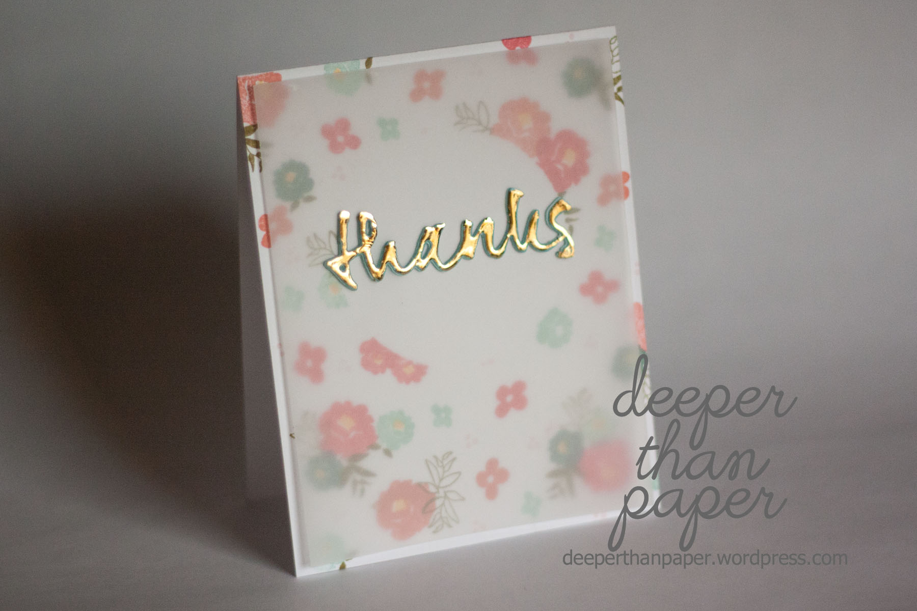
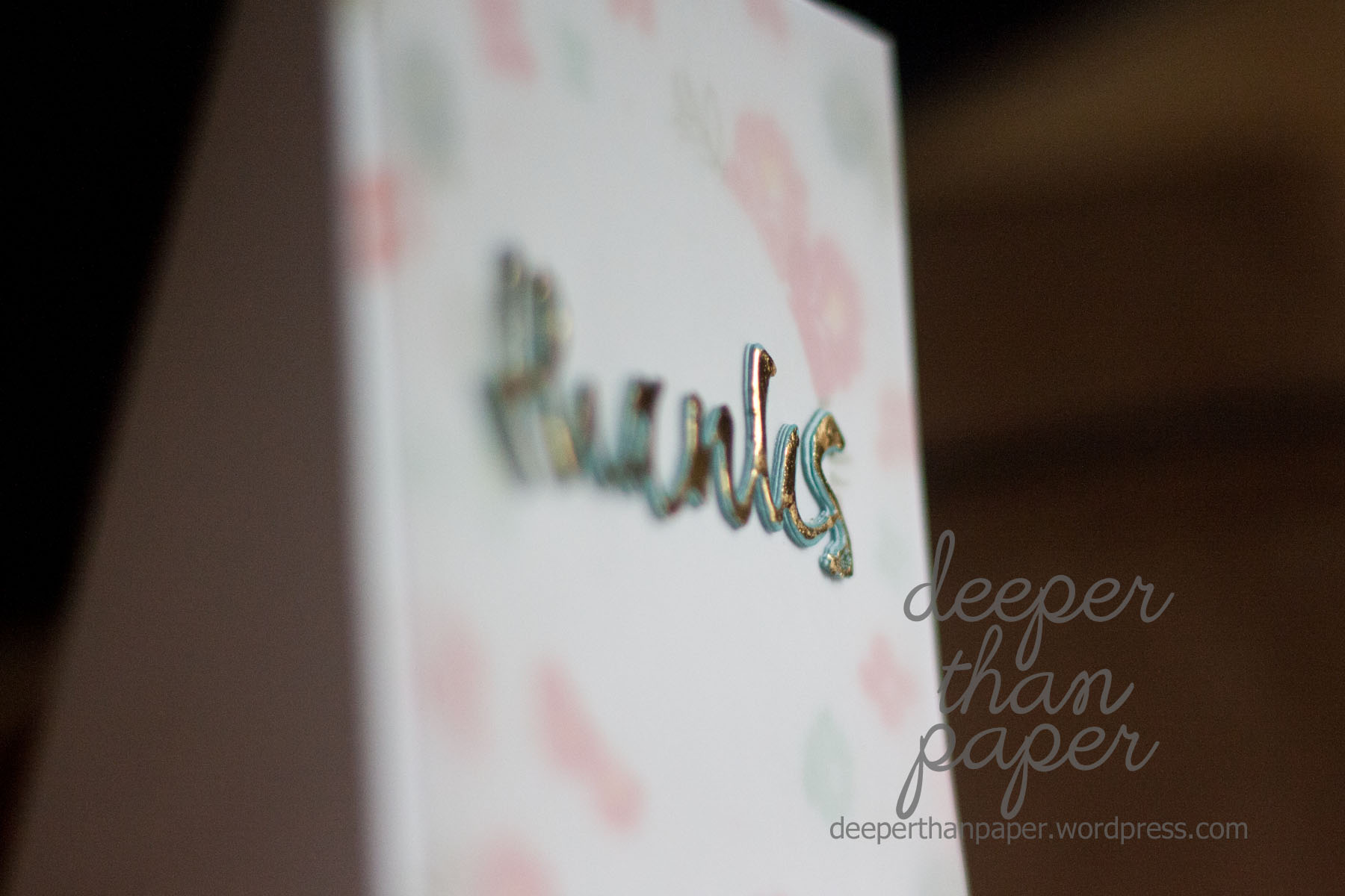
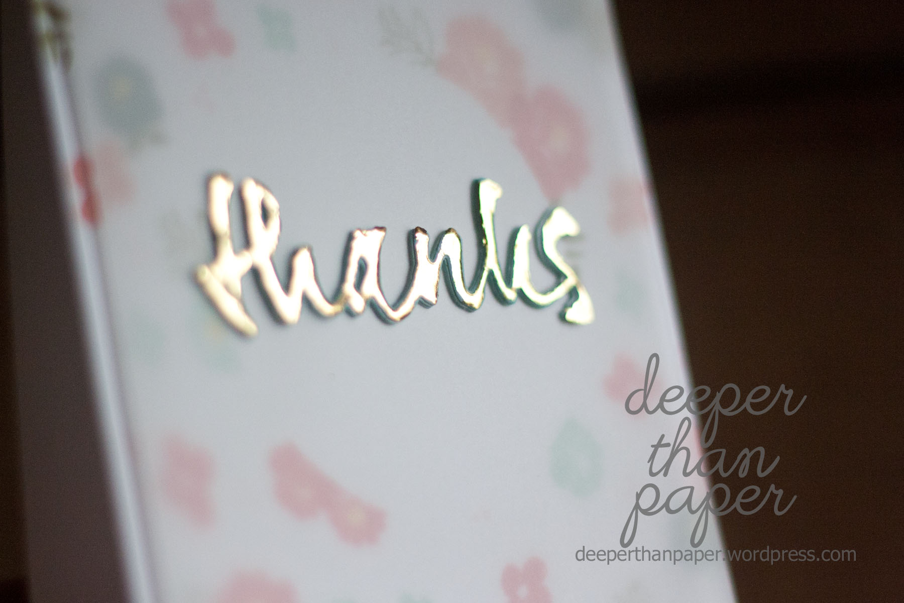
I also did a fun new technique that ended up being different than I intended, but is really neat! I used this technique from Jennifer McGuire to use stamps and foil. But thinking I could make it work a bit better, I did two layers of embossing powder on the die cut. Well, it didn’t help foil better, but it gave it a really cool outline!
Supplies: Neenah cardstock, Papertrey Ink (Graceful Greetings stamp, Ripe Avocado, Ocean Tides, Aqua Mist, Melon Berry, Sweet Blush, Berry Sorbet, vellum, wet paint die), Bazzill cardstock, Minc foil

Lovely card! I also am not a big velum fan and I really want to try foiling! It’s neat to see new things successfully done, gives me motivation =)
LikeLike
Your background stamping is simply gorgeous! Lovely card.
LikeLike